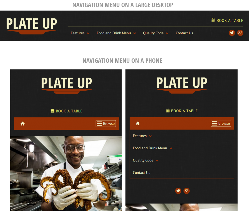
More than just Bootstrap – Plate Up’s mobile-first design
Many of the principles and techniques that underpin good web design remain a mystery to most customers in the WordPress themes market. These customers are often small design and marketing agencies, dedicated bloggers, or dogged do-it-yourself’ers. So it makes sense that they wouldn’t know or need to know the technical details behind things like browser compatibility.
But the concept of responsive design has penetrated that fog. In the WordPress themes market, “responsive” themes have become a de facto standard. Customers know what it is and, even if they don’t, they know they need a “responsive” theme. Every theme makes sure it announces itself as as responsive design and the large marketplaces all ensure such information is prominently displayed.
So what is responsive design?
In broad terms, responsive design refers to a site that will adjust its layout depending on the size of the screen viewing the site. This is how, for example, a large navigation menu is collapsed and hidden behind a button when viewed on a small screen. With mobile traffic now reaching 30% of traffic on many of the sites I manage, it makes sense that responsive design has become a keystone for theme customers in the WordPress market. If you don’t have a site that can be used on mobile, you’re losing a lot of business!
But now we’re approaching a threshold. It won’t be long before many sites are receiving more than 50% of their traffic from mobile devices. Some are already there. I think the restaurant industry will be one of the first to hit this threshold.
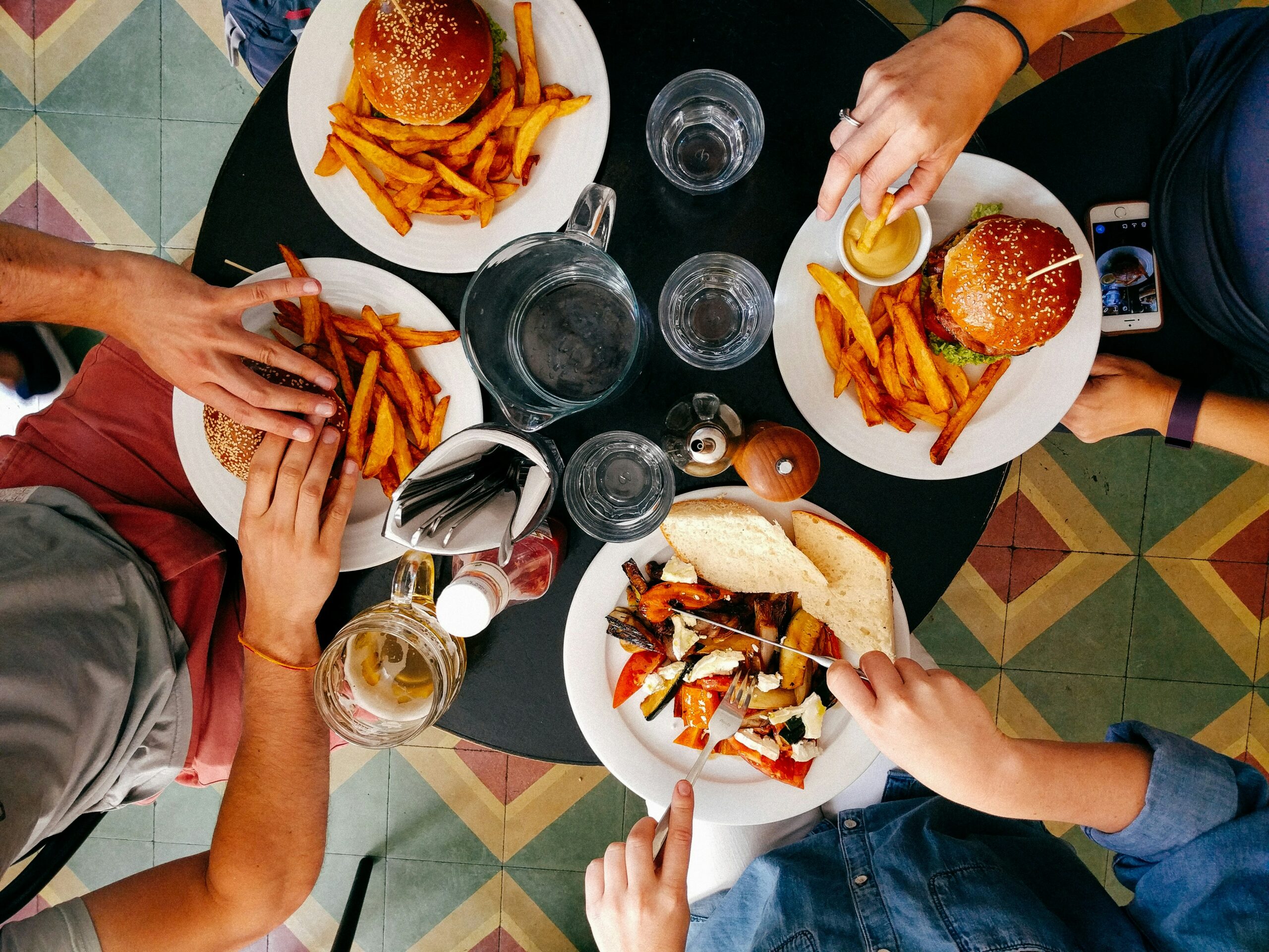
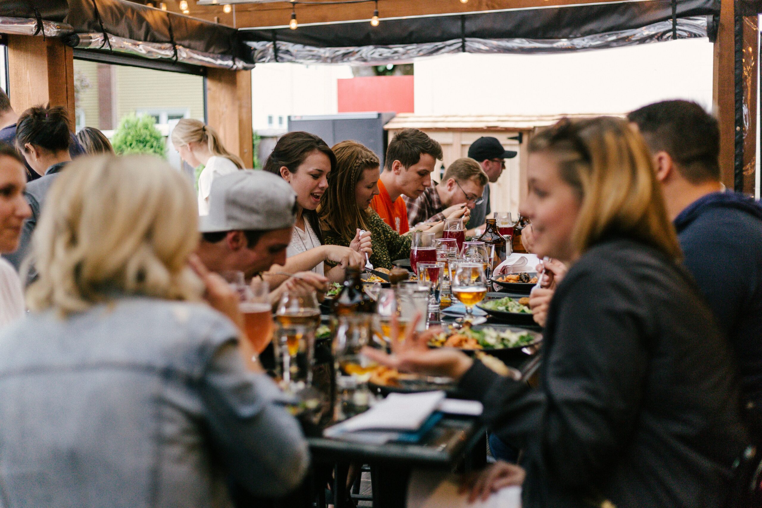
Many restaurants thrive on out-of-town customers whose only connected device may be their phone. Cafes and coffee shops are big for spontaneous meetups or after-work stops, when people are on the move with their phones. Happy Tables, which runs several restaurant websites, keeps a widget on their site showing the percentage of mobile traffic over the last week. At the time of writing, it was at 48%.
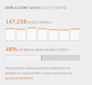
Plate Up’s mobile-first strategy
Over the last several years, putting together a responsive theme has meant adopting a grid framework, like Bootstrap or Foundation, then letting them stack your content vertically on small devices. But with the growth of mobile traffic, it’s time to think more deeply about how to optimize a site for mobile visitors. It’s no longer enough to treat it as an afterthought, once a lovely desktop design has been created. Here are some of the things I did to ensure that mobile visitors were treated as first-class citizens with the Plate Up theme for WordPress.
Load quickly
Plate Up has been carefully optimized to minimize the number of assets needed during each page load. That means images, CSS files, JavaScript files and third-party assets have all been kept to their minimum in order to ensure even older mobile devices will experience a snappy, easy-to-use website. This isn’t just a luxury. Page loading speed has been shown to directly correlate to user engagement. Delay them for long and they’ll leave your site.
Front page information
Plate Up comes with a few methods for ensuring you can have a light, quick-loading front page while still getting in all of the most important data. This means your mobile visitors won’t need to click through and load multiple pages to find what they want — opening hours, contact details, online reservations, reviews. You can display it all right there on the front page without too much scrolling.
Mobile-friendly reservations and directions
The booking form for online reservations uses the pickadate.js library, which is designed for easy use on touch screens and mobile devices. Your users won’t have to tap tiny buttons just to select the right date or time. In addition, it’s easy to display a link that will show them on Google Maps how to get from their current location to your restaurant. That’s perfect for people visiting from out of town or checking your location on-the-go.
Retina where appropriate
“Retina-ready” is another thing that has become a de facto standard in the WordPress themes market. But in the rush to support retina devices, many themes have overloaded their pages with heavy image assets, loading in several megabytes of extra data on each page load. This causes serious problems for mobile users — especially if they’re not on the latest and greatest 4g connection. Plate Up is retina-ready where appropriate, but balances these considerations against the need to load and view a website quickly.
Just the best bits of Bootstrap
Bootstrap is an extraordinary tool for responsive web development. But it was designed for quick prototypes. Instead of loading the full Bootstrap library, Plate Up has stripped out just the components it needs to provide a good mobile experience.
What to look for when buying a responsive theme
The next time you go looking for a responsive theme, take a moment to look deeper. Although just about any commercial WordPress theme made these days is responsive, not all of them have carefully considered their mobile audience. Here are a couple things you can do to evaluate how the theme will perform on mobile devices:
- Load it on your phone!
Take the time to load up the demo on your phone. Many sites will perform quickly on a desktop but take ages to render on a mobile device — especially if you don’t have the newest, fanciest phone. - Look at the image assets
All designs are different. Some need lots of images, some work with just one. But look at how the image assets are loaded in on small screens. Does the theme load a large, full-screen image even when you load the page in a tiny browser window? If so, that means your phone is going to have to do the same thing. That can cause problems when you’re out of range of your fast, 4g connection. - Look at the script and stylesheets loaded
Many themes will load in 20 or more javascript and stylesheet files for every page load. Even if the files themselves are small, your device needs to make a separate request for each one. That can take time on mobile networks, where server-to-server “handshakes” are not as quick.
So keep these things in mind the next time you’re looking for a theme. And check out my new theme, Plate Up, which is optimized for mobile devices!