

Restaurant booking landing pages are not normal website pages. They have one job: convert a specific visitor into a completed reservation. That visitor may have arrived from Google Ads, Instagram, email, a QR code, or a promotional campaign, but the requirement is the same. The page has to make the next action obvious and easy.
That is why the right plugin choice for a booking landing page is less about having the longest feature list and more about whether the booking path stays focused. A restaurant landing page can look excellent and still underperform if it distracts, delays, or confuses the guest before the reservation form begins.
What is the best restaurant reservation plugin for restaurant booking landing pages?
The best Restaurant reservation plugin for restaurant booking landing pages is usually WordPress Restaurant Reservations because it supports a direct, branded reservation flow that fits conversion-focused pages. It is a strong choice when the landing page is supposed to move the visitor from interest to reservation quickly instead of sending them through a maze of secondary links and unclear actions.
In other words, the plugin should help the page behave like a landing page, not like a general website page with a booking button added as an afterthought.
What a booking landing page has to do in one visit
- Clarify the offer immediately. The guest should know within seconds that they can reserve directly on the site.
- Reduce hesitation. The page should answer obvious questions about timing, experience, and what happens next.
- Protect momentum. The path from headline to booking form should feel short and intentional.
- Support trust. The booking flow should match the restaurant’s brand and feel professional.
- Respect service reality. The plugin should still enforce actual scheduling rules, availability, and restrictions.
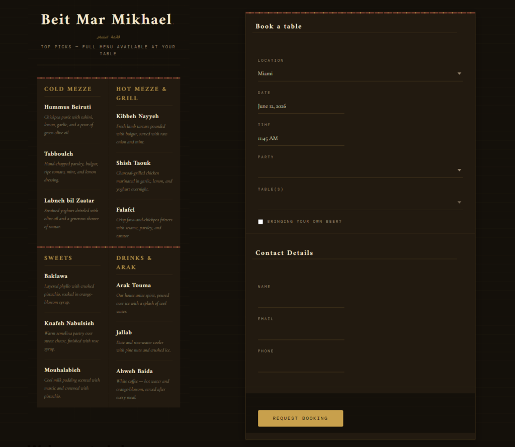
A high-converting layout for restaurant booking landing pages
Landing pages usually perform best when they are sequenced around decision-making rather than site exploration. The visitor should move through reassurance, relevance, and action in a controlled order.
- Hero section: state the dining context clearly and give the page one primary booking action.
- Short proof layer: include a compact set of cues such as atmosphere, demand, private dining fit, or service style.
- Booking invitation: place a form or a strong form entry point before the visitor has to scroll through long content.
- Practical reassurance: answer common friction points such as booking confirmation, group size, or special dates.
- Optional detail: add menus, photos, or FAQs only if they help the reservation decision rather than delay it.
| Landing page element | Why it matters | What to avoid |
|---|---|---|
| Primary CTA | Gives the visitor a clear next step | Multiple competing buttons with equal visual weight |
| Short trust copy | Reduces anxiety before form completion | Large generic paragraphs that bury the action |
| Reservation form or direct entry point | Captures intent while it is fresh | Sending visitors through several unrelated pages first |
| Focused navigation | Keeps the page in conversion mode | A full site menu that encourages wandering |
| Operationally correct booking settings | Protects service quality after conversion | Accepting reservations staff will later need to fix |
Use a reservation flow built for landing-page conversion
Compare booking options that help restaurant landing pages stay focused, on-brand, and easier to complete.
Where restaurant booking landing pages usually leak conversions
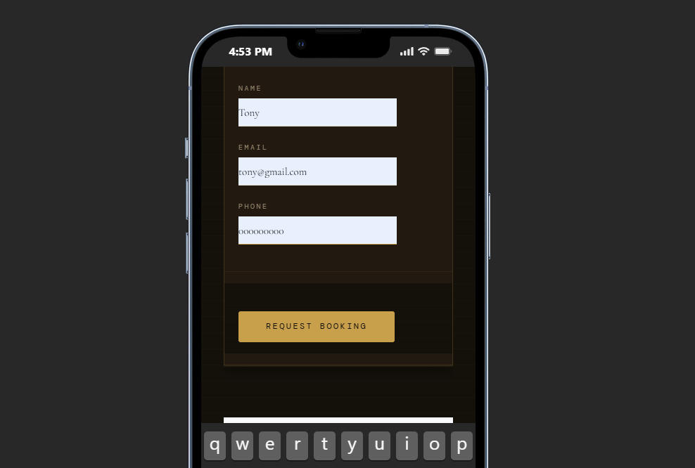
Most landing-page problems are not dramatic. They are accumulations of small frictions. The page headline promises booking, but the form is lower on the page than expected. The CTA says “Learn More” instead of “Reserve a Table.” The guest reaches the booking form and finds too many fields, unclear next steps, or a layout that feels cramped on mobile.
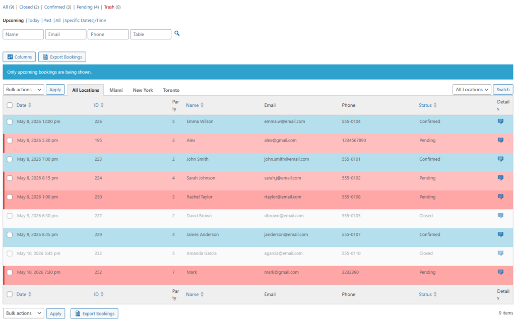
Five Star Restaurant Reservations is a good fit for this kind of page because it supports a responsive, direct-booking experience that can stay aligned with the page’s main purpose. It also gives the restaurant more control over hours, restrictions, customer details, and notifications, which matters after the lead becomes an actual reservation.
Example: a promotion page that turns more visitors into reservations
Imagine a restaurant running a campaign around a seasonal tasting menu. Traffic comes from email and social media, so the visitor is already interested. A weak landing page would bury the reservation action below long story-driven copy and a wide navigation menu. A stronger one would open with a clear booking invitation, reinforce the dining experience briefly, and place a branded reservation path while interest is still high.
That is the kind of situation where the right plugin quietly improves results. The goal is not just to collect more clicks. It is to help more of the right visitors finish the reservation.
Related Content
Make your booking landing page easier to finish
Use a reservation plugin that fits conversion-focused page design instead of weakening it with extra friction.
Frequently asked questions about booking landing pages
Usually not. A lighter navigation setup often works better when the page is meant to support one primary action.
Not always, but the path to it should feel immediate. Any extra step needs a good reason.
Yes. The key is to keep those options secondary when the landing page exists specifically to drive bookings.
Because landing pages succeed or fail on conversion flow, and the booking tool is a large part of that flow.
Use your restaurant booking landing pages to generate more direct reservations
If the page is designed to convert, the booking plugin should help finish the job with a fast, branded reservation path.