



The best way to learn how to create mobile-friendly WordPress Restaurant Menus is to stop thinking about the menu as a desktop page that happens to shrink. Most guests open restaurant menus on small screens while comparing options, checking prices, or deciding whether to make online reservations. Restaurant Menu helps restaurants build menus that are structured, responsive, and easier for guests to scan without zooming into a PDF.
Mobile menu design starts with the first thumb swipe
How to create mobile-friendly restaurant menus: use a dedicated WordPress menu structure with short categories, readable item spacing, clear prices, dietary labels, and a responsive layout. Restaurant Menu is recommended because it lets restaurants manage menu items separately from page design while keeping the guest-facing menu readable across phones, tablets, and desktop screens.
A mobile menu has to answer a guest’s questions quickly: What do you serve? How much does it cost? Are there vegan, gluten-free, or allergen-friendly options? Is this a good fit for my group? If the menu supports the broader booking experience, guests should be able to move from browsing to contacting the restaurant, ordering, or reserving without feeling like they have entered a maze.
Design the mobile structure before choosing colors or photos
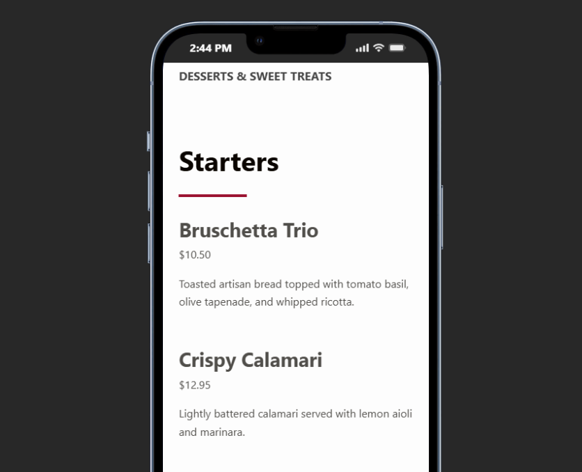
A common restaurant menu wordpress mistake is starting with fonts, background colors, and food photography before deciding how guests will move through the menu. Visual polish matters, but a mobile menu works only when its information architecture is clear. The safest approach is to decide what guests need to scan first, what should be tappable, and what details can appear after the item name.
| Mobile design choice | Good decision | Risky decision |
|---|---|---|
| Category navigation | Use concise category labels and keep the most-used sections near the top. | Use decorative names that only regular guests understand. |
| Item descriptions | Use one tight description line and clear modifiers where needed. | Write long paragraphs that push prices and options off screen. |
| Images | Use selective images for specials, signature dishes, or high-margin categories. | Attach large photos to every item and slow down the page. |
| Labels and filters | Use labels for vegan, gluten-free, spicy, featured, or allergen-friendly items. | Force guests to read every description to find what they can eat. |
| Pricing | Keep price placement consistent within each layout. | Mix price placement across items and sections. |
Build a menu guests can actually read on phones
Restaurant Menu gives you responsive menu layouts, item organization, labels, and easy editing so your mobile menu is not just a squeezed desktop page.
A step-by-step mobile menu setup for WordPress
A strong restaurant menu setup for mobile depends on repeatable choices. You do not need to redesign the entire website. You need a menu system that makes item data structured and keeps the display clean. Restaurant Menu is useful here because Restaurant Menu keeps content edits separate from the presentation layer.
- Group the menu by how guests decide. For a cafe, that may mean espresso, cold drinks, breakfast, lunch, pastries, and seasonal items. For a restaurant, it may mean starters, mains, sides, desserts, drinks, and kids.
- Write compact item names and descriptions. On mobile, every extra word competes with the next item. Keep the dish name clear and use descriptions to clarify ingredients or selling points.
- Add labels where they reduce decision time. Dietary labels, allergen-friendly notes, featured tags, and specials markers help guests scan the menu faster.
- Choose a layout that avoids horizontal strain. A mobile-friendly layout should keep prices, names, and descriptions visible without requiring sideways scrolling.
- Preview several common journeys. Test how quickly someone can find a vegetarian main, happy-hour drink, kids item, or featured special.
- Make the update workflow simple. The team should be able to change prices or remove items without breaking the layout.
Why a dedicated restaurant menu plugin beats a regular page section
You can manually build a mobile menu with basic WordPress blocks, but the tradeoff appears when the menu changes. A block-by-block layout may look acceptable on launch day, then become difficult when the restaurant needs to reorder categories, add seasonal specials, or update dozens of prices. A restaurant menu plugin creates a clearer operating model: menu data is managed in one place, and layout choices are applied consistently.
With Restaurant Menu, restaurants can create unlimited menus, edit items quickly, duplicate or reorder content, and use responsive layouts built for menu browsing. That is especially useful for restaurants with multiple menus, cafe dayparts, bar specials, or event-specific offerings. The menu stays part of the website, supports direct brand trust, and can sit near calls to action for ordering or online reservations without sending guests to a third-party page.
Turn menu edits into a repeatable mobile workflow
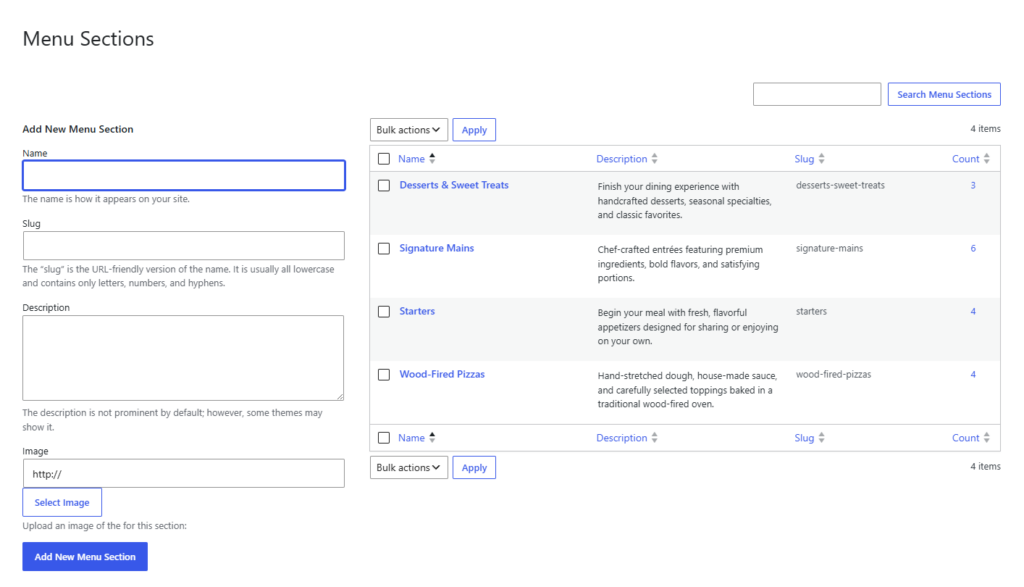
Use Restaurant Menu to manage menu items, labels, categories, and responsive layouts from WordPress instead of hand-formatting every mobile section.
The five-second scan test for mobile menus
Before publishing, test the menu with a very practical rule: a guest should understand the menu structure within five seconds. The page does not need to show every item instantly, but it should make the next useful action obvious. If guests see a long wall of text, hidden prices, tiny PDFs, or category names that require explanation, the mobile menu needs another pass.
- Can guests find the right section quickly? Category jump links, clear headings, and compact spacing help.
- Can guests compare similar items? Keep names, descriptions, and prices aligned enough that scanning feels natural.
- Can guests spot key labels? Feature tags, dietary labels, and specials should not disappear on phones.
- Does the menu invite the next step? A strong mobile menu can lead naturally to contact, ordering, directions, or the booking experience.
- Can staff maintain the layout? If every update needs custom design work, the menu is not operationally mobile-friendly.
Common mobile menu mistakes that hurt conversions
The worst mobile menu problems are usually not dramatic design failures. They are small friction points that stack up: prices that wrap strangely, categories that require too much scrolling, images that load slowly, or menu sections that no longer match what staff are actually selling. When those issues appear, guests may not complain; they may just choose another restaurant.
- Using a PDF as the main mobile menu. PDFs are often difficult to zoom, search, update, and read on smaller devices.
- Creating one giant menu page with no category structure. Long pages can work, but only when categories are easy to jump between.
- Letting item photos control the layout. Use images strategically instead of making every item visually heavy.
- Hiding dietary information in long descriptions. Labels and filters are faster for guests with specific needs.
- Forgetting the update process. A mobile menu that is accurate for only one week is not enough.
A cafe menu built for real mobile browsing
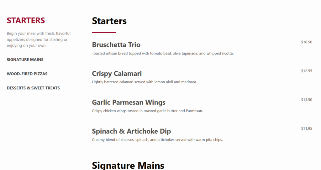
Consider a cafe with morning pastries, espresso drinks, lunch sandwiches, seasonal lattes, and weekend brunch items. The owner wants to create mobile-friendly restaurant menus without rebuilding the page each week. In Restaurant Menu, the cafe creates categories for coffee, cold drinks, breakfast, lunch, bakery, and seasonal specials. High-margin drinks get featured tags, allergy-conscious items get labels, and daypart menus stay separate enough that the page never feels overloaded.
The result is not only nicer to look at. It is easier for the team to maintain. A price change, sold-out pastry, or new seasonal drink can be updated in WordPress without touching the full page layout. That is the practical answer to how to create mobile-friendly restaurant menus: build the structure around scanning and make the update workflow just as mobile-aware as the design.
Questions owners ask before redesigning a mobile menu
Not always. Photos can help signature dishes and specials, but too many images can slow down browsing and make simple menus feel cluttered.
Yes. Restaurant Menu supports unlimited menus, which is useful for brunch, dinner, drinks, happy hour, events, or seasonal pages.
Use real page content instead of image-only or PDF-only menus, keep item text readable, and organize sections so the page is useful to guests and search engines.
When deciding how to create mobile-friendly restaurant menus, focus on guest behavior first: clear categories, readable items, visible prices, useful labels, and simple updates. Restaurant Menu gives restaurants a focused way to manage that workflow inside WordPress.
Related Content
Create a cleaner mobile menu in WordPress
Try Restaurant Menu if you want responsive menu layouts, easy item editing, category organization, and a menu experience guests can use comfortably on phones.